Western Casa: a platform for hard-to-move luxury listings, designed and shipped in code
High-end listings sit on the market because agents can't tell which enquiries are real fit leads for the asset. Western Casa is a production, multi-tenant SaaS that gives each agent a branded listing page with an embedded Buyer Match Quiz, scoring how ready and how appropriate a buyer is before the lead reaches them, then firing a one-tap WhatsApp opener.
I owned all of it: product design, information architecture, and the front-end build. The computeMatchScore engine, a versioned scoring rubric, a multi-tenant Postgres model with row-level security, and Mexico's LFPDPPP privacy law implemented end to end.
FOR SALE · SANTA ROSA FUNDADORESCasa Rosa MoradaIS THIS HOUSE FOR YOU?
2 BEDROOMS2 BATHS110 M²$4,640,000 MXN
BUYER MATCH QUIZ01 / 03
What is your budget?
Under $2M$2–4M$4–6M$6M+
0PRIORITYRoute now. Agent notified in under five seconds.
WhatsAppnowNew contact · Just finished the quiz on Casa Rosa Morada…
01ListingBuyer lands. One call to action.
Problem
Luxury agents lose deals to slow response. The industry norm is 20–45 minutes to a new lead, and published research (MIT Sloan, HBR) ties response time directly to conversion, while agents burn hours on buyers who were never going to close.
Approach
A per-listing branded page with an embedded Buyer Match Quiz that scores intent before the lead reaches the agent, then fires a one-tap WhatsApp opener. Only qualified buyers get through, and they arrive with a score the agent can act on.
What I designed & built
computeMatchScore() is a pure, auditable function turning buyer inputs (budget, timeline, financing, origin) into a 0–100 score, a tier, and a transparent breakdown. A versioned per-listing rubric, never mutated in place. A multi-tenant Postgres model with row-level security and full attribution. Shipped in six phases (and squashed a Vercel serverless dangling-promise bug along the way).
Compliance & outcome
Mexico's LFPDPPP end to end: versioned privacy notice, consent timestamping, automated ARCO rights on a 20-day SLA. Live with first client Kari Estrada (Century 21 Heavenly), a $4.64M MXN listing. Leads arrive scored, with consent and attribution captured.
— WESTERN.CASA · SYSTEM DIAGRAM
Platform Architecture — Multi-Tenant
TENANCY · row-level security
SCALE · N agents × N listings
DEPLOY · single Vercel project
01
Presentation
— Tenant A
agent_slug = 'kari-estrada'
Listing Page
app/[listing]/page.tsx
Buyer Match Quiz
components/BuyerMatchQuiz.tsx
↳ rosa-morada.western.casa
— Tenant B
agent_slug = 'agent-2'
Listing Page
app/[listing]/page.tsx
Buyer Match Quiz
components/BuyerMatchQuiz.tsx
↳ casa-luna.western.casa
02
API
Shared Application Runtime
— single codebase · every tenant
Route Handler
app/api/qualified-leads/route.ts
computeMatchScore Engine
lib/scoring/real-estate.ts
Notification Dispatch
lib/notifications/{buyer,agent}.ts
03
Data
— ROW-LEVEL SECURITY BOUNDARY
POLICY · WHERE agent_slug = auth.tenant()
Supabase · Postgres 15
MANAGED · US-EAST-1 · DAILY BACKUP
real_estate_leads
Every lead scoped by (agent_slug, listing_slug). Same table serves all tenants; RLS isolates rows.
WESTERN.CASA platform architecture. One codebase and one Postgres table serve every tenant; isolation is enforced at the database by a row-level security policy rather than in application code.
The Buyer Match Quiz scoring pipeline. computeMatchScore is a pure, deterministic function with no I/O. It takes quiz inputs and a versioned rubric and returns a score, a tier, and a per-factor breakdown. That makes it fully unit-testable, and it locks the rubric version to each lead at capture so historical scores stay explainable.WESTERN.CASADemand funnelRosa Morada · multi-tenantFIG D
Locate → Translate → Stage → Compound
The stage worth owning is the one where an enquiry becomes a lead worth calling.
Reach is easy to buy and closing belongs to the agent. The stage in between is the one nobody owns, so that is the one the platform runs: turning an anonymous enquiry into a scored, routed lead an agent can act on.
Western Casa demand funnel. The platform works at one stage, scoring and routing enquiries, because that is the step the media side and the sales side both leave alone. Stage labels only; no volumes are published.
Architected · cross-surface product
Pawmates: architecting the retention core as a founding member
Founding member of a hyperlocal social app for pet owners. I architected Neighbourhoods, the core retention feature, as a cross-surface system spanning six product surfaces around a single shared state key (homeHoodId).
I reframed the company's central problem from downloads to neighbourhood density(10 / 25 / 100 verified-user thresholds, now the north-star metric), and locked the hard product decisions in an interactive prototype before engineering ever touched them.
Role
Product designer · founding member
Scope
6 product surfaces, one shared state key
Craft
25+ prototype iterations · ~80 prototype flows · 30 screens and 7 task flows in the MVP
Shift
Downloads → density as the north-star metric
PAWMATESinteractive
Problem
13,000 users spread thin across a US, Canada and Europe, with retention falling off inside a week. Density, not downloads, is the product: below a threshold, the neighbourhood reciprocity loop never spins up.
Approach
With the founder, I reframed the north-star from downloads to neighbourhood density (10 / 25 / 100 verified-user thresholds) and architected Neighbourhoods as a cross-surface system around one shared state key, homeHoodId.
What I did
25+ prototype iterations and ~80 prototype flows, narrowed to 30 screens and 7 task flows for the MVP. Locked three product decisions in prototype before spec: hood-first Meet, Lost-Pet alerts opening a direct chat, and choosing a home hood during onboarding. Designed a two-loop retention architecture (in-app density loop + IRL dog-park loop) and named push notifications as the load-bearing gap.
Research
Two inputs shaped Neighbourhoods. The first was thirteen user interviews and prototype testing: the three decisions locked before spec — hood-first Meet, Lost-Pet alerts opening a direct chat, and choosing a home hood during onboarding — were shaped by watching people use the prototype. The second was the behavioural record in Mixpanel. Roughly 100,000 downloads with retention falling off inside a week said the problem wasn't getting users; it was giving them a reason to come back.
What I owned
The roadmap and the specs. I ran the engineering walkthroughs, and scoped the priority list to what the team could build rather than to everything we wanted.
Outcome
The density framework became the company's north-star metric, converted into a sequenced nine-project roadmap, with the founder-blocking decisions resolved before engineering handoff.
PAWMATESNeighbourhoodsCross-surface mapFIG A
The null column is the product work
One optional field drives six surfaces, so the real work was deciding what each does when it’s empty.
Setting a home neighbourhood is optional at signup, so every surface that
keys off it needs a decided answer for the empty case. Those decisions are the actual product
work, not the field itself.
Single fieldhomeHoodIdusers.home_hood_iduuid · nullable · set at onboarding step 3
Behaviour of each surface when homeHoodId is set versus null
Surface
Behaviour when homeHoodId is set
Fallback when homeHoodId is null
Feed
Hood tab is the default; the feed shows posts from your home hood.
No Hood tab. Global “For You” only, with a persistent set-your-hood prompt.
Map
Opens centred on your hood with its boundary drawn; pins scoped to it.
Centres on device GPS. No boundary, so pins run city-wide.
Lost Pets
Alerts scoped to your hood; posting defaults to it.
Posting still works (last-seen 1 km radius). No hood alert feed to subscribe to.
Notifications
Hood activity (new neighbours, meetups, alerts) drives push.
No hood push: the re-engagement channel goes dark. Account and DMs only.
Ad Targeting
Placed in the hood’s targetable inventory for local advertisers.
Not locally targetable. Falls back to city-level or house ads.
Search
Results boosted and ranked by home-hood proximity.
Global results, no local ranking boost.
The null column is the figure. Each fallback is a decision,
not a default. Every surface degrades to something intentional, never to a broken state.
Role
Product definition and spec for the field the whole app keys off.
Surfaces touched
6
Constraint
Optional at signup, so every surface must degrade gracefully.
Pawmates Neighbourhoods. A single nullable field, homeHoodId, set once
during onboarding, changes how six product surfaces behave. Because it is optional, each surface needed
a designed fallback rather than an error state.
PAWMATESRetentionTwo-loop architectureFIG B
Two loops, one shared step
Two loops that would run separately, except both pass through post.
A content loop and a local loop, each one self-sustaining. Both pass
through the same step, so activity in either feeds the other, and a user who arrives through the
neighbourhood ends up inside the content loop without being asked to.
Content loop
postshares to the feed · shared node
engagementlikes · comments · saves
notificationreaction → push
returnopens the app again
→ returns to step 01 (post)
Local loop
neighbourhoodhome-hood feed
discoverynearby duos & places
connectionfollow · message
postshares to the feed · shared node
→ returns to step 01 (neighbourhood)
Content loop
Trigger: a post is published. Signal:notification open-rate → return sessions
Local loop
Trigger: a home hood is set. Signal:new connections per active duo
Role
The two cycles that bring users back, and where they interlock.
Loops
2 · content, local
Shared node
post
Pawmates retention architecture. Two independent loops, one driven by content and notifications and one by neighbourhood discovery, both pass through the same step of publishing a post.
That shared step is what couples them instead of leaving two separate products.
Owned · concept to public beta
NODE: a research browser shaped around behaviour, taken to public beta in eleven days
NODE is a desktop browser for niche research. It reads the page you are on, picks the keywords, and suggests what to read next. It keeps a trail of the session, plays video in several tabs at once, and lets AI agents read the web without signing in as you.
I took it from a rough prototype to a public beta between 10 and 20 October 2026. I owned the product, the design and every decision. I wrote or approved each spec and judged every build on my own Mac; an AI build partner wrote the code from those specs.
Role
Product owner and designer · AI build partner as the engineer
Shipped
111 commits · 50+ backlog items across 5 phases · 22 end-to-end test suites
v0.9.0 public beta on Mac, Windows and Linux, auto-updating · 95 downloads and 216 running copies at 21 Oct 2026
NODEbeta · cycle 1
How deep-sea animals make…
http://abyssalnotes.example/article.html
AbyssalNotesOceanLifeExpeditionsOcean life · Long read
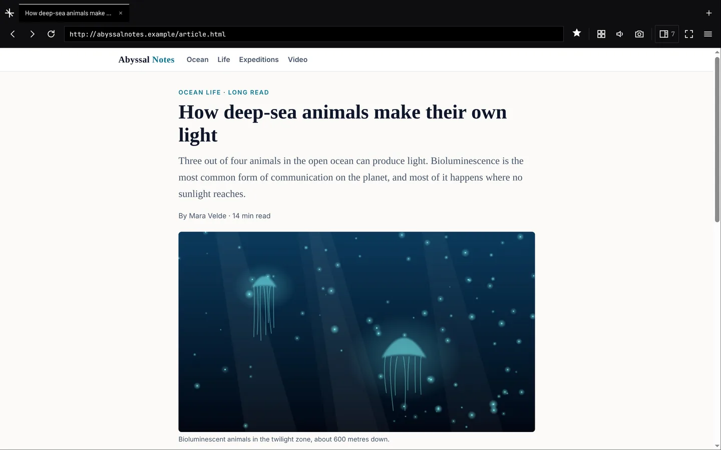
How deep-sea animals make their own light
Three out of four animals in the open ocean can produce light. Bioluminescence is the most common form of communication on the planet, and most of it happens where no sunlight reaches.
By Mara Velde · 14 min read
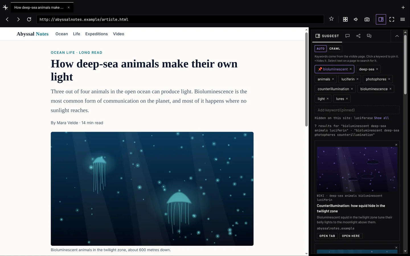
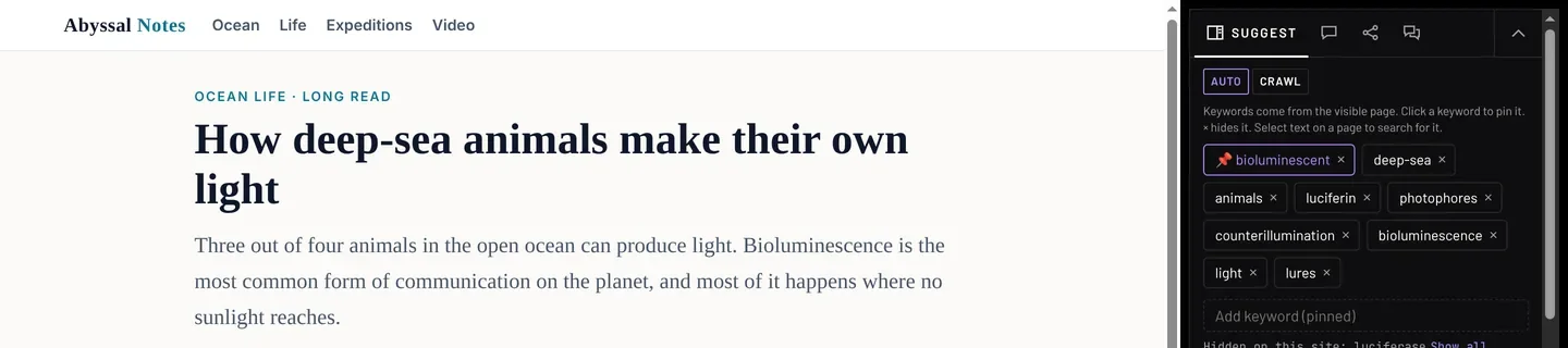
NODE on an article, drawn in its own design system rather than photographed. Keywords are read from the visible page and sit in the widget beside it — one pinned to the front, the rest hideable — with suggested pages underneath: Wikipedia first, in about a second, web results merging in as they land. The widget is 340px and the page keeps the rest.
Problem
NODE is for people who dig into one narrow topic for hours. They follow a thread page to page, keep videos and sources open side by side, and lose track of what they have read. A normal browser treats every page on its own, so the research lives in their head and a pile of tabs.
The principle
One question drives NODE: how can internet research be shelled as a behaviour? Read. Follow a thread. Watch sources side by side. Ask. Remember. Hand work off. NODE wraps each of those in a shell around the web — a module that runs on every page, which you can switch on, off or change per site. A feature only goes in if it is a research behaviour, and each one gets its own rules, controls and motion.
How it was built
I ran NODE as product owner and designer with an AI build partner as the engineer. Every piece of work ran the same loop: a brief or a spec, costly choices returned as options with a recommendation for my call, a build that passed the end-to-end suites before it reached me, my own use of it on a Mac, and the decision written down with its reason. Rules I set on day one and kept: plain language in every label, the NODE brand on every visual, no disguised traffic, and no public release without my go-ahead.
Designing around the constraint
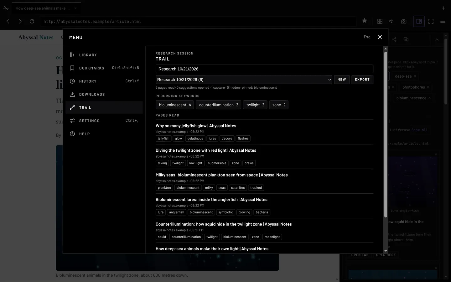
In Electron every web page is a native view drawn above the app’s own HTML, so nothing in HTML can sit on top of a page. That one limit shaped most of the interface. Tooltips use the system tooltip. The Capture menu is a native menu. A menu over a page takes a picture of the page, hides the live one and shows the menu over the picture, fading out before the live page returns. The suggestions widget sits beside the page and narrows it rather than floating over it. Electron offers four preset curves, so NODE steps the page along the CSS curve itself, about sixty times a second.
Changing the design when it failed in use
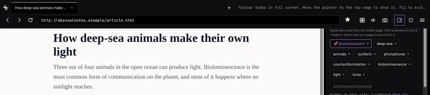
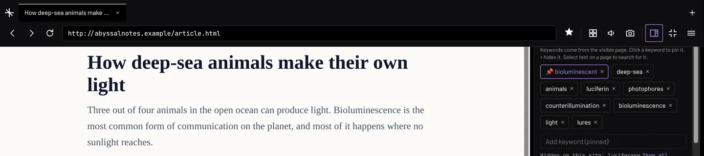
The full-screen toolbar went through six versions in one evening. The first met the spec and was still wrong: the toolbar and page slid down together, and the text I was reading jumped every time I went near the top. Safari became the reference — the page never moves. Each version after that fixed what the last one showed, down to the macOS menu bar sliding in over the tab row. The sixth is three options and my call, still pending.
Trust as design
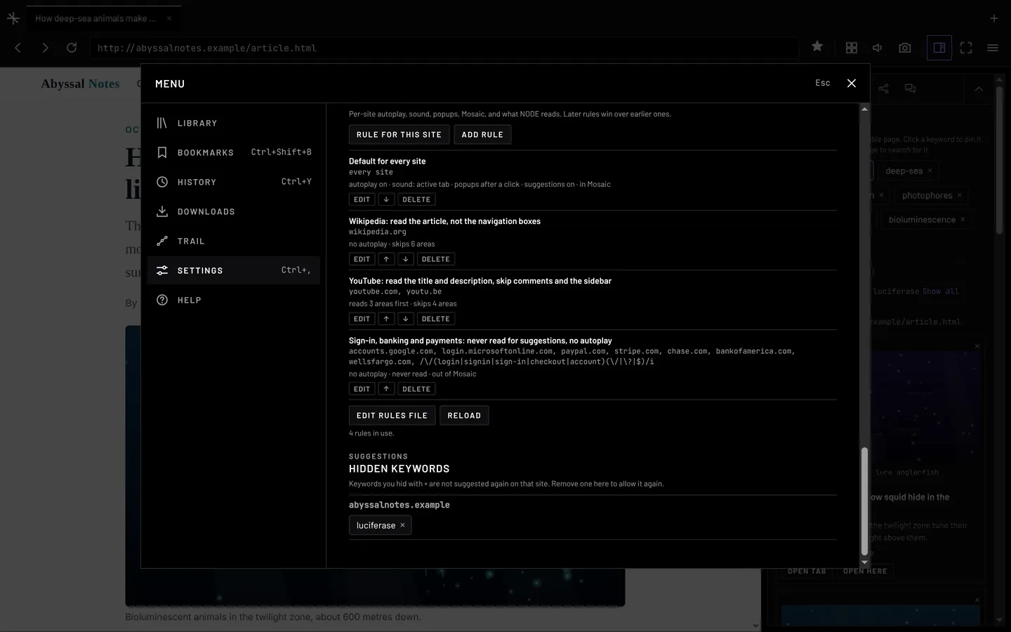
A browser that reads every page and lets AI agents use the web can do real harm, so every feature has a rule for what leaves the computer and what an agent may touch. Sensitive pages are never read. Agents work in a separate session with none of your sign-ins, and never sign in, click or fill forms. The agent server is off by default: local only, token required, rate-limited, logged, with a stop switch. Twelve prompt-injection pages run before every release. Background requests say they are NODE rather than disguising themselves — ResearchGate blocked NODE as a bot, and honesty won over disguise.
The beta, run as a study
v0.9.0 went public on 15 October, recruited on Reddit, with the ask that testers fix what they find using their own coding agents. I set fixed targets, decision rules and a review date rather than posting and waiting. Six days in, the numbers had already moved a priority: Windows is 73% of downloads and I had tested mostly on a Mac, so Windows is now the main beta platform and the next release is tested there first.
Results, and what is not known yet
Between 16 and 21 October, downloads went 28 to 57 to 95 and running copies 32 to 113 to 216. Update checks per download rose from 1.1 to 2.3, which says people are opening NODE again rather than trying it once. Reddit sent 130 of 132 referrals. Zero issues from testers, and the first comments ask for more of what is there: two requests went into the backlog with priorities. The four questions the beta exists to answer — does it work, does it help, do people come back, would they miss it — depend on the survey, which closes 5 November. They are open, not answered.
What is next
NODE is in Phase 4, release readiness, and the gate is a week of daily use with no blocking bugs. The open P0 is keeping sign-in, account and payment pages out of the trail, because those addresses can otherwise reach agents and exports. Then the full-screen fix, Mac checks for the last four motion interactions, the survey prompt and usage summary for 0.9.1, and code signing. The Chromium build is paused on purpose: finish the build people are using before splitting the effort.
How can internet research be shelled as a behaviour?
Site rules switch any behaviour on, off or change it, per site. One shared core runs every behaviour in every build.
Hover a behaviour to read what it covers.
Follow Pinning a keyword, hiding anotherWatch Four live tabs at once
Remember The session trail
Switchboard Rules, per site
The principle the product is built on. A feature only goes in if it is a research behaviour, and each one gets its own rules, controls and motion. The six are not a feature list — they are the test a feature has to pass. Four of them are recorded above; Ask and Delegate have no recording yet, so nothing stands in for them.
Six gated phases. Four done, release readiness now
Phase 0Safety, basicsGate Camera and mic ask first; shortcuts work inside pagesDone
Phase 1Keyword engineGate Text-only articles give relevant keywordsDone
Phase 2Network layerGate An hour of browsing with no search blocksDone · passed on the Mac, 18 Oct
Phase 3Behaviour shellGate A new site behaviour by editing a rules file, no codeDone
Phase 4Ready to releaseGate A week as my daily browser with no blocking bugsNow · v0.9.0 public beta
Phase 5Mobile appGate React Native on the shared core; the gate is set when it startsLater
No phase starts until the gate before it passes, and safety came first: the prototype granted camera and microphone access without asking, so that was Phase 0. Mobile waits for the Phase 4 gate rather than running beside it.
Fewer words in the toolbar. Every icon still has a name
Collapsed — the page gets full widthOpen — 340px beside the page, not over it
BeforeAfterWhy
Word buttons: Mosaic, Sound: one, PiP, Shot, Save, Media, Library36px icons with a name and shortcut on hover. Shot, Save, Media and PiP become one Capture button with a menuFour capture icons are four shapes to learn. One button with a labelled menu is one
A 225px sidebar, always openA 340px widget beside the page. Collapses into the toolbar with a result count and “+N new”The page gets full width when you are not researching. New results still show
Ask, Talk, Agent, Trail, Settings as chips, each with a Back buttonSuggest, Ask, Agent, Talk as tabs. Trail and Settings move to the menuTabs replace Back buttons. The widget holds only what you use while reading
Library as a shelf under the toolbarOne menu: Library, Bookmarks, History, Downloads, Trail, Settings, HelpOne place for what you open now and then
Full screen kept the toolbarThe toolbar hides and comes back at the top edgeFull screen should be the page
A 112px toolbar96pxThe extra 16px was empty
The widget opens; the page narrows with it, holding an 8px gapOne menu, over a picture of the page — a native view cannot be covered by HTML
Two days of redesign, 19 and 20 October. Three directions were mocked up on a canvas; this is C, grouped icons each with a tooltip. The principles are from my design library: recognition over recall, progressive disclosure, Fitts’s law at 36px, and focus returned to the button that opened the menu.
Six versions in one evening
Version 1 met the spec and was still wrong. I judged it by how it felt while reading, and Safari set the bar: the page never moves. Each version after that fixed what the last one showed.
Entering — the hint says where the toolbar wentFull screen is the pageThe toolbar returns at the top edge
#What it didWhat I sawWhat I decided
1Toolbar and page slid down 96px together on a cubic-bezierDizzying. The text I was reading jumped every time I went near the topCopy Safari. The page never moves
2Toolbar in its own layer, sliding over a still pagemacOS slid its menu bar and title bar down too, over the tab rowRest the toolbar below the system bars
3Toolbar rests 52pt down, below the barsMoving onto the toolbar, macOS hid its bars and left a gapMove up with the bars
4Toolbar moves up when the pointer leaves the barsmacOS kept its bars a moment longer. The toolbar went back under themStop guessing macOS’s timing
5Toolbar stays below the bars; the space above is filled in the toolbar’s colourBetter overall. A taller toolbar for a momentAsked for a better fix
6Three options: read the bars’ position from macOS, window buttons in the tab row, or an “always show toolbar” settingNot built yetMy call, pending
The toolbar slides down over a still page. The app cannot see the pointer over a native view, so it reads the pointer position every 100ms.
The clearest case of changing a design because of how it felt in use rather than because it missed a spec. The sixth version is three options and my call, still pending.
Four durations, four curves, eleven interactions
--motion-fast120msHover, exits, turning off. Every fade under Reduce motion
--motion-base200msSmall things arriving, turning on
--motion-slow320msResult cards arriving, tabs going into Mosaic
--ease-exitcubic-bezier(0.4, 0, 1, 1)Leaving. Starts slow, leaves fast
--ease-movecubic-bezier(0.4, 0, 0.2, 1)Moving between two states
--ease-typesteps(14, end)Typing only
Every animation uses one of these. No hard-coded values. Transform and opacity only, with four agreed exceptions. Exits are faster than entrances. Motion follows the confirmed state, not the click. Only on user action. Reduce motion removes the movement and keeps the fade at 120ms.
01Sound toggleColour fades to violet on, back offOn 200ms · off 120ms
02Card readOpened card dims to 60%; “read” badge fades in200ms
03Mosaic labelNew label rises 3px and fades in200ms
04Bookmark starSave grows from 60% like a stamp; remove is a quick fadeSave 200ms · remove 120ms
05Agent stepsIn the Lab →Each new step types out, left to right160ms, 14 steps
06Keyword chipsIn the Lab →Pinned chip goes violet and moves to the front; the rest slide200ms · hide 120ms
07Result cardsNew cards fade in one after another; × fades a card, then the gap closes320ms, 40ms stagger · out 120ms
08Mosaic tabsIn the Lab →The active page shrinks into its tile, and grows back over the othersIn 320ms · out 200ms
09Full-screen toolbarSlides down over a still page, back up when the pointer leavesDown 200ms · up 120ms
10Suggestions widgetSlides in from the right edge; the page narrows with it, 8px gap heldOpen 200ms · close 120ms
11MenuScrim and panel fade in over a picture of the page, out before the live page returnsIn 200ms · out 120ms
04 · Bookmark star · app05 · Agent steps · prototype07 · Result cards · app
Each interaction was specified, built and committed on its own, with a decision note, three checks and a demo. The three marked are written up in full in the Lab. The bookmark star and the result cards here are recorded from the running app; the agent type-out has no app recording yet, so it stays the approval prototype, as the Lab entries are.Beta cycle 119 Oct – 5 Nov 2026 · review 5–6 Nov
Signal, v0.9.016 Oct18 Oct21 Oct
Installer downloads285795Windows 69 · Mac 16 · Linux 10
Running copies checking for updates32113216Windows 181 · Mac 25 · Linux 10
Update checks per download1.12.02.3People are opening it again, not trying it once
Unique repo visitors—190238130 of 132 referrals from Reddit
Issues from testers000
Survey responses—00Survey live; closes 5 Nov
NODE sends no usage data, so GitHub’s download and update counts are the only signal that arrives on its own.
The four questionsMetricTargetState
Does it work?Open blocking (P0) bugs at the end00 today
Does it work?No problems, or worked around them80%+Survey Q3
Does it help?Suggestions led to a page they read “often” or better50%+Survey Q4
Does it help?Finding sources “faster” or “much faster”50%+Survey Q5
Do people come back?Using NODE 7 days or more30%+Survey Q2, Q10
Would they miss it?“Very disappointed” without NODE40%+Survey Q8
Targets do not move until the review. Five of these six answers come from the survey, which closes 5 November — so they are open, not zero.
Pawmates: people would build their dog’s profile and not their own, so the dog went first
Onboarding had two profiles, one for the owner and one for the dog, and the owner’s came first. Across ten moderated sessions people were patient and talkative building the dog’s — volunteering mood, curiosity, habits, the things it is obsessed with, humour, likes and dislikes, whether it photographs well — and flat building their own. So the problem was not the number of fields. It was which subject the fields were about.
The two profiles swapped order. Nothing was cut: four steps were resequenced behind the dog profile and the location permission was deferred past the first feed view, so the part people want to do earns the goodwill that carries them through the parts that serve the product. Completion went from 61% to 79% among users who start onboarding.
Role
Study, recommendation and spec · the founder was the decision owner
The two profiles swapped order · four steps resequenced behind the dog profile, none cut
Result
Onboarding completion 61% → 79% among users who start onboarding
Method
Before and after the redesign, not a randomised split
Date
2025 · built on by a 2026 design and UI pass
PAWMATESonboarding · 2025
The two profiles swapped order. Nothing was cut.
Before
Friction before willingness
01Owner profileThe product’s ask, first
02Dog profileThe part people wanted
03PermissionsIncluding location
04Tutorial
After
Willingness first, and it pays for the rest
01Dog profileThe part people wanted, first
02Owner profileBehind the goodwill
03PermissionsLocation deferred past the first feed view
04Tutorial
Four steps were resequenced behind the dog profile. Which four is not in my record, so they are not named here.
The finding was an asymmetry between two profiles, not a step count, so the fix was an order change rather than a cut. The warm row is the part people volunteered detail for; the cold row is the one they went flat on.
Problem
Completion was low. The standard move is to shorten onboarding, and from the funnel alone that means cutting fields evenly across both profiles — which would have cut the dog fields, the one part people were motivated to finish. The funnel showed where people left. It could not show why, and the why pointed the other way.
What people actually said
Unprompted and at length, while building the dog profile: mood, curiosity, habits, what it is obsessed with, humour, likes and dislikes, whether it photographs well. Those are social attributes. People were not entering data, they were presenting their dog to other people — and on a social product that input is the content.
Why the order mattered
In the original flow the owner profile came before the dog profile. The friction arrived before the willingness, so nobody had spent their patience by the time they reached the part they resisted. Fatigue does not explain it.
The change
The dog profile moved to the front. The personal profile, the permissions and the tutorial sit behind it. Four steps were resequenced rather than deleted, and the location permission was deferred past the first feed view. Progressive disclosure and reserved space for error messages were applied where motivation was lowest, not uniformly.
A second check on the fatigue reading
The fix tests the alternative explanation. After the change the mundane steps come later in the flow, and completion still rose. If accumulated effort were the cause, pushing that work further back would have made it worse.
Protocol
Ten participants, mixed ages and tech comfort, recruited through local pet groups, Instagram and known owners. The sample deliberately included people who do not own pets, because one of the four tasks asked what the app is for and a target user already knows. Moderated, remote or in person, 30 to 40 minutes. Think-aloud, screen and audio recording, one facilitator and a note-taker. Four tasks: start onboarding, build the dog profile, say in your own words what the app is for, find another dog nearby.
Why think-aloud, and not a click-tracked test
Think-aloud is why the study produced a finding and not only a number. The asymmetry showed up in what people said while working, not in what they completed — a click-tracked test would have shown the same drop-off with no reason attached. Later rounds ran a cut-down version, five users and three tasks, small enough to run every cycle.
What the number is, and what it is not
Completion runs from starting onboarding to finishing it, so acquisition sits outside both ends of the measure. The resequencing made the step change in 2025; a 2026 design and UI pass — a progression bar, bigger completion buttons, tighter spacing — doubled down on the same effect rather than revisiting it, and completion kept improving. I do not claim the swap did all of it. A sequencing decision that kept paying across two passes is the better argument.
What I would do differently
Hold a cohort back so the result is attributable. Code the transcript rather than reading it from session notes. And look at per-step drop-off in instrumentation before the sessions, so the moderation could be aimed at the steps already losing people instead of discovering it live.
The transferable version
Onboarding should open with the thing the person came to do, and spend the goodwill from it on the steps that serve the product rather than the person. Permissions, tutorials and account fields are the product’s asks, not the user’s. Put them behind something the user wanted. That is a claim about sequencing motivation, not about pet apps.
Five figures, five different bases
Three of these describe the same product and measure different things on different populations. Collapsing them into one claim is the error this table exists to prevent.
FigureWhat it measuresOn what basePeriodMethod
61% → 79%Onboarding completionPeople who start onboardingBefore the 2025 redesign, and nowInstrumentation. Before and after, not a randomised split
29.3% · +18ppThe same change, relative and absoluteSameSame61.1% → 79.0% is 29.30%
>80%Task completion inside the study10 study participantsThe study itselfModerated observation against a threshold set beforehand
45.6%Profile completionAll downloads, around 100,000Five-year averageInstrumentation
13,000Peak user base—Peak, not concurrent with the download totalInstrumentation
Roughly 58% of downloads start onboarding, which is how 45.6% and 79% are both true at once.
Limits
A before and after, not a randomised split. Other work shipped in the same period, so the redesign is not isolated from it.
I also ran the paid media in that window. The metric runs from starting onboarding to finishing it, so volume cannot inflate it, and if cheaper acquisition had brought in more marginal users a completion rate should have fallen. That argument assumes cheaper meant lower-intent; if the improvement came from better-targeted audiences instead, the traffic got higher-intent and that would flatter the rate.
Ten participants is enough to find a usability problem and not enough to size one. The effect came from instrumentation afterwards, not from the sessions.
The in-session task completion rate and the instrumented completion rate measure different things on different populations. They are reported separately above for that reason.
Volunteered rather than waited for. The sharpest question this study invites is the paid-media one, so it is answered second.
Every figure here, with its base and method, is on the work record.
Systematized · design-to-code
Pawmates: a design system engineering builds from
I built and documented the full design system: design tokens (tokens.js), a typography scale, a UI component library, and the DuoAvatar pattern that treats the pet-owner pair as one identity unit.
The system was built twice. The first pass was the 2025 redesign: a UI update to current practice, with new onboarding and matching flows, built on a Figma design system. The second pass came with Neighbourhoods, when the system was rebuilt and propagated into tokens.js so engineering read the same values the design file did.
Then I audited the shipped app against its own documentation, caught the drift (a stale purple against the live #7828F0), and set the corrected values as the single source of truth. That is the kind of design-to-code reconciliation that keeps a team on-model without asking.
Role
Design systems
Deliverable
tokens.js · component library · living guide
Method
Design-to-code, shipped-app drift audit
DESIGN SYSTEMinteractive
tokens.js · as-built v0.8colour · space · radius · type · elevation
T.purple across three sources
Tokens
CLRpurple#7828F0
SPCspace.28px
RADradius.pill100px
CLRred#EF4444
AaTYPtext.title15px
SPCspace.416px
CLRborder#E5E7EB
ELVshadow.blur4px
CLRpurpleLight#EFEAFE
RADradius.card16px
CLRdark#1A1A2E
AaTYPtext.chip12.5px
STRborder.width1px
SPCspace.312px
CLRgrey#6B7280
RADradius.image8px
ELVshadow.alpha.12
CLRredLight#FEF2F2
AaTYPtext.meta11.5px
CLRpurpleDark#5512C4
CLRgreyLight#F5F5F7
Components
Segmented control
For YouNeighbourhood
Composer chips
PhotoPlaceAlert
Status pills
Lost & FoundUrgent
Buttons
PrimarySecondaryGhost
Post card
🐶Maria G.Luna
☕
New dog-friendly café on Dundas West📍 Dundas West · 15m ago
♡ 47▢ 9
Bottom nav
HomeMeetChatDiscoverProfile
Hover a token to see what it governs. Hover a component to see what it is made of.
Three purples existed. The document specified #6B3FA0, a published Figma style
carried #6B25DA, and the app shipped #7828F0. Colour was only the visible half — spacing, radius and
elevation had drifted the same way.
Problem
The design documentation had drifted from the shipped app, including a stale brand purple, with no single source of truth for engineering to build from.
Approach
Reverse-engineered the live app and reconciled three prior draft systems into one canonical reference, visual and verbal.
What I built
Design tokens (tokens.js), a compressed typography scale, a UI component library, and the DuoAvatar pattern that treats the pet-owner pair as one identity. Codified non-negotiable brand rules: pet purple, owner orange; one gradient; lost-red reserved for alerts.
Outcome
Audited shipped against documented, corrected the drift (#6B3FA0 → the live #7828F0), and delivered an interactive brand guideline as the single source of truth the team builds from.
DESIGN SYSTEMFigma → tokens.js → ComponentsPawmatesFIG A
One definition, every surface
Components reference a token instead of storing a colour, so one change moves everything.
The Figma library and the code read the same values. A colour is changed once in
Figma, updated once in tokens.js, and every component that imports it moves with it.
READ BY Button · Segmented control · Chips · Focus ring
Source
The Figma library. Design edits the colour, not the component.
Pipeline
Figma → tokens.js → components import T.
Result
One edit, every surface. This is how three different purples were reconciled to #7828F0.
How one Pawmates colour moves from the Figma library, through tokens.js as the single source of
truth, into the rendered components. A colour change becomes one edit rather than a search-and-replace
across components.
DESIGN SYSTEMComponentsButtonFIG B
Small API, large visual surface
Three props and two CSS states cover twenty rendered cells.
Every cell below is a live element rather than a screenshot, the same component rendered under each combination. The system is what keeps that surface manageable
instead of twenty hand-built buttons.
Rendered in the as-built Pawmates tokens · T.purple, T.redScroll horizontally →
Button component rendered across four variants and five states
variant \ state
default
hover
focus
disabled
loading
primary
secondary
ghost
destructive
interfaceButtonProps {
variant?: 'primary' | 'secondary' | 'ghost' | 'destructive'
disabled?: boolean
loading?: boolean
label: string
icon?: IconName
onPress: () =>void
}
// variant, disabled and loading are props.// hover and focus are CSS states — never props.
Generative surface3 props + 2 CSS states → 20 cellsvariant (4) × state (5) = 20 rendered cells from one styled component.
Component
Button
Props
variant · disabled · loading
Rendered states
20 · 4 variants × 5 states
The Button component from the Pawmates design system, rendered live across every variant
and state combination in the as-built tokens rather than this site’s palette. Hover and focus are
deliberately CSS states rather than props, which keeps the component API at three inputs while the
visual surface covers twenty cases.
DESIGN SYSTEMBrand guidelinePawmates tokensFIG C
Rendered from the tokens, not transcribed
The guideline reads the same tokens the product reads, so it can’t go stale.
Every swatch, size and ratio below is resolved at render time from the
token declarations. The hex labels and the contrast numbers are computed rather than typed, so
changing a token changes the guideline with it.
The swatch fill and this label’s text read the same var(). Change the
token and both move together. A stale value is structurally impossible, not merely
discouraged.
As-built reconciliation: the design-system document specified
#6B3FA0. The shipping app used #7828F0. The token file follows the app, because the
document was the stale one. The profile-chip palette was undocumented entirely and was recovered
by sampling the build.
Type scale · font-size: var(--text-*)
Display--text-display · 44 / 700
Heading--text-heading · 32 / 700
Title--text-title · 22 / 600
Body copy for reading--text-body · 15 / 400
Caption--text-caption · 13 / 500
MICRO LABEL--text-micro · 11 / 600
Colour set · background: var(--*)
purple
#7828F0
purpleDark
#5512C4
purpleLight
#EFEAFE
purpleMid
#9678D2
pink
#E8449A
orange
#F5A623
red
#EF4444
dark
#1A1A2E
white
#FFFFFF
Contrast · WCAG 2.1 · computed from tokens · pass/fail marked in text, not colour
dark · white17.1:1AA ✓AAA ✓
purple · white6.2:1AA ✓AAA ✗
purple · purpleLight5.3:1AA ✓AAA ✗
orange · dark8.4:1AA ✓AAA ✓
orange · white2.0:1AA ✗AAA ✗
red · white3.8:1AA ✗AAA ✗
pink · white3.7:1AA ✗AAA ✗
Spacing ramp · width: var(--space-*)
--space-1 · 4px
--space-2 · 8px
--space-3 · 12px
--space-4 · 16px
--space-6 · 24px
--space-8 · 32px
--space-12 · 48px
Source
Token declarationsthe same custom properties the product renders from
Coverage
type · colour · spacingas-built v0.8
Guarantee
A view, not a copyit cannot drift out of date
The Pawmates brand guideline. Values are the as-built v0.8 tokens; hex labels and WCAG
contrast ratios are computed at render time from the resolved values rather than typed, which is
how the reconciliation above was found in the first place. Several real pairs fail AA and are
marked as failing.
02 · Range
Ward 8 · campaign intelligence
A data-driven strategy brief for a municipal council race: turnout and demographic analysis, incumbent-vulnerability assessment, and an electoral-math case for a winnable path.
Sead · functional-ingredient system
Mapped 38 functional ingredients across a wellness restaurant's menu into a dual-audience interactive reference: clinical for staff, plain-English for guests.
The method travels beyond design: research, strategy, and systems, applied wherever the edge is.
03 · Signal
“
We have worked together on Pawmates for over 5 years. Isaac has grown in that span exponentially to reach a level of agency and judgement of a true Product leader. I listen to his judgement and acknowledge that his signal-to-noise work ethic made him instrumental to our start up. Truly a great Product Design Founder.
Colin Jarvis-Gaum · Founder, Pawmates“
When I first met Isaac I was unsure on why he’d want to work with me on resolving a unique real estate problem, moving this hard to sell property. After some conversations about what my problem was, where I wanted to go and some research together, he came up with a solution to not only one but three common real estate problems.
Kari Estrada · Century 21 Heavenly, Los Cabos
04 · Contact
Need one person to own design, build, and the result?
Isaac Sven ManzanarezProduct designer · design engineer · Connecticut · NYC metro · South Florida